Comparing Two Typography Choices
2026-09-28 • By Chloe Bennett
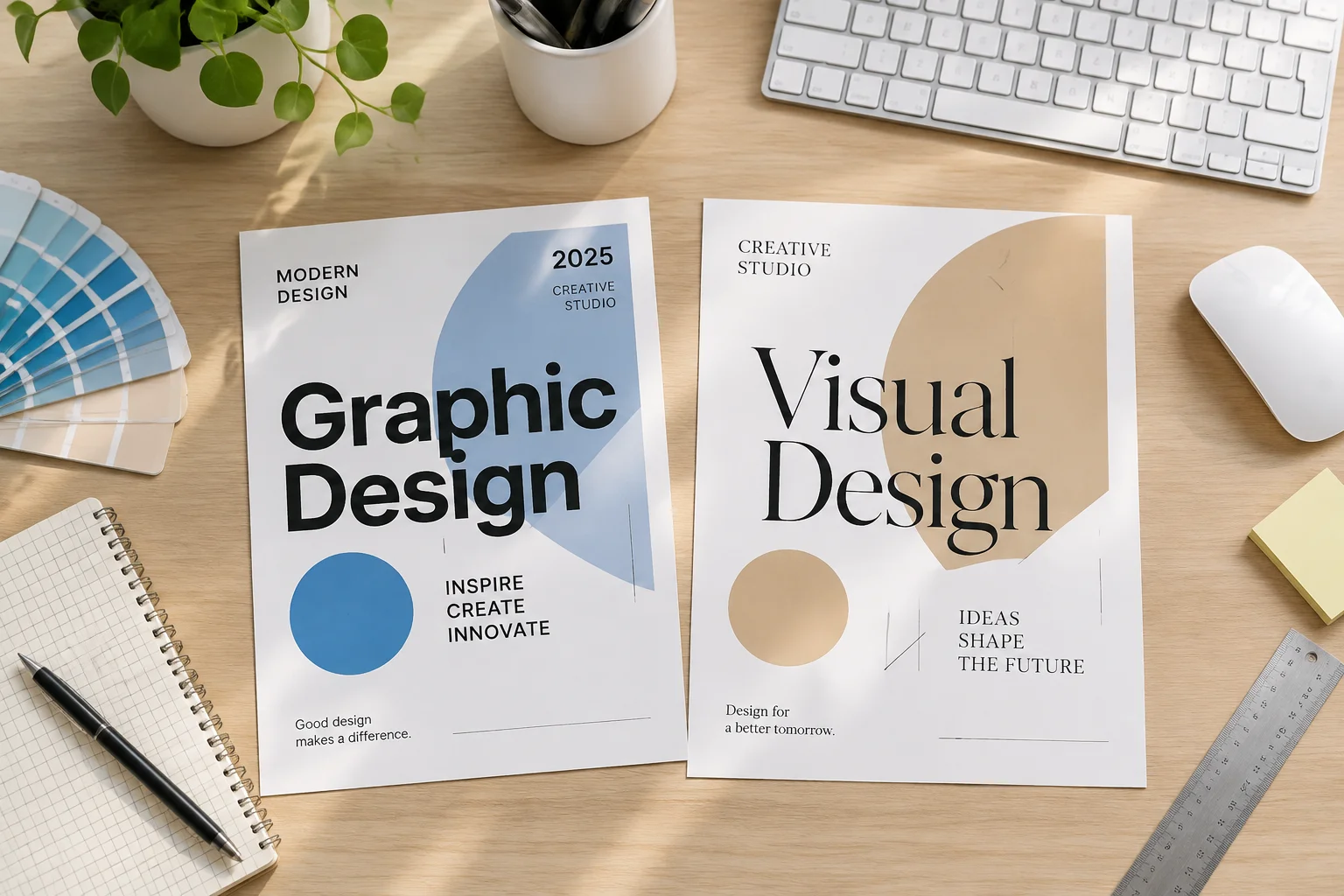
Choosing letterforms for projection
The debate between serif and sans-serif typefaces remains one of the most critical decisions in presentation design. When projected onto large, low-resolution surfaces, the subtle strokes of serif fonts can often blur, leading to cognitive fatigue, while heavy sans-serif choices might appear too industrial or clinical. This case study examines two distinct typography choices for a standard information slide.
Compare strokes and spacing
We analyzed how letter height, stroke thickness, and overall kerning affect readability from a standard viewing distance. In many scenarios, the font family choice influences the viewer's reading speed significantly more than the font size itself. By observing how each font interacts with background light intensity, designers can determine which style suits the specific lighting conditions of the venue.
Use weight to guide the eye
We also investigated how various weight variations—bold, medium, and regular—within the same family can be used to establish a hierarchy without changing the typeface entirely. Maintaining visual consistency while prioritizing legibility requires a deliberate approach to font selection. Our findings suggest that for most digital projection tasks, clarity should always supersede traditional stylistic preferences.
Summary of analysis
- Serif fonts with thin strokes often suffer from anti-aliasing issues on low-contrast projectors.
- Sans-serif fonts offer better clarity when the viewer is at a significant physical distance from the screen.
- Consistency in stroke width helps maintain uniform contrast across varying ambient light environments.
- Excessive line height with heavy fonts may cause characters to blend together when viewed on smaller auxiliary monitors.
- Always test your chosen font against the brightest and darkest background colors used in your slide deck.