
Layout•October 25, 2026•Julian Vance
Reviewing Text Scaling Decisions
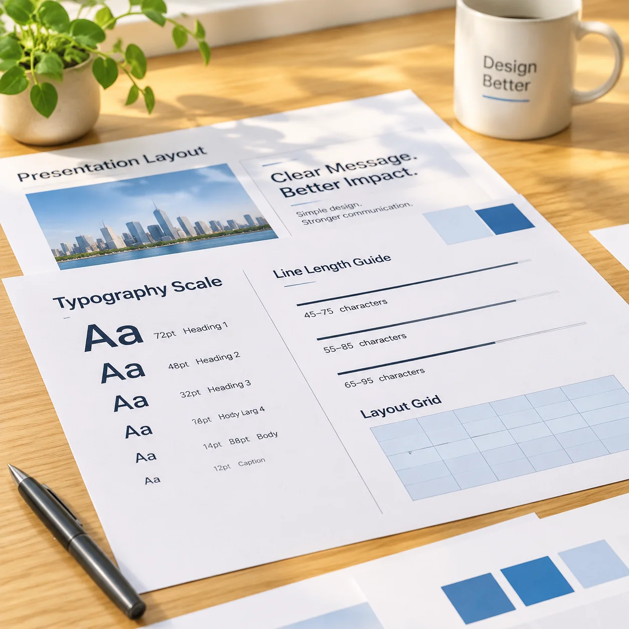
Why automatic text scaling compromises readability during live presentations and how to audit bounding boxes manually before going live.

Explore text hierarchy, line length, contrast, layout consistency, and theme decisions through independent slide-design cases. SlideReadability Lab explains the visual choices behind presentation readability.
Read the ProPresenter Theme Text Review guide →Explore our four core diagnostic tools right from your browser. Adjust contrast filters, line lengths, visual hierarchy tiers, and pre-flight checklist criteria.
Test how background hues, dark backings, and projection washes affect text legibility.
High legibility across typical 20ft to 60ft presentation viewing distances.
Ensure every attendee in row thirty reads line breaks without cognitive strain or squinting under ambient hall lighting.
SlideReadability Lab is an independent publication committed to human comprehension in auditoriums, houses of worship, and classrooms. Review our scope below to see if our methodology matches your standards.
Practitioners who prioritize rear-row legibility, typographic balance, and repeatable guidelines over uncalibrated templates.
Presentation Designers
Building multi-speaker slide systems with standardized line counts and typographic hierarchies.
Live Event Operators
Managing high-lumen stage projection where ambient light threatens soft gray text and low contrast.
Media Volunteers & AV Technicians
Configuring house-of-worship lyric slides and announcement feeds without accidental text cut-offs.
Creative & Communications Teams
Standardizing organization-wide theme tokens so non-designers maintain consistent margins and spacing.
Educators & Keynote Lecturers
Replacing slide overload with structured chunks that audiences absorb in under 3 seconds per view.
To save your time, we are explicit about workflows and expectations our publication does not support.
Decorative Template Collectors
Those seeking 3D clipart packs, floating animations, or ornate graphics rather than structural legibility.
Fully Automated Slide Generation
Creators looking to paste raw documents into AI tools without human review of line breaks and contrast ratios.
Unrestricted Text Density
Teams insisting on copying whole paragraphs onto single projected frames without content condensation.
Vendor-Sponsored Software Endorsements
Users looking for promotional software reviews. We remain independent and unaffiliated with third-party vendors.
When screen design prioritizes decorative graphics or convenience over typographic hierarchy, audiences disengage quickly. Review the most damaging patterns and their verified structural remedies.
When multi-sentence announcements appear at once, line lengths stretch beyond 80 characters. The human visual track cannot retain place across broad screen spans, causing listeners to abandon reading altogether.
Independent rehearsal surveys demonstrate comprehension falls by over half when informational density exceeds two main points per frame.
Explore real operational reviews with step-by-step layout recalculations from our research library.
Why automatic text scaling compromises readability during live presentations and how to audit bounding boxes manually before going live.

Best practices for ensuring typography remains comfortably legible when positioned over complex, dynamic photographic backgrounds.
Before handing event decks or design templates to outside agencies, verify whether they design for real-world audience perception or simply decorate desktop screens.
Evaluates whether they calculate distance-to-height ratios or merely pick aesthetic sizes on high-res desktop monitors.
Reveals if they rely on dangerous software auto-fit options that silently reduce distant legibility during live services.
Checks if they understand the drastic difference between self-lit OLED displays and optical front projection.
Verifies whether they isolate typography from background texture or allow complex imagery to interfere with letterforms.
Measures understanding of cognitive tracking across broad physical canvases under brief presentation exposures.
Determines whether they design resilient recurring systems or fragile single-use graphics that drift within weeks.
Explore our editorial review methodology or print the companion comparison checklist before evaluating preliminary vendor mockups.
Before & After Delivery
Compare common slide composition breakdowns with calibrated readability standards developed to protect audience attention and speaker confidence.
Presenters and media volunteers frequently fight information density, unmeasured text scaling, and low-contrast palettes that fail across wide rooms.

How to identify cognitive overload on a slide and strategies for reduction.
Applying verified hierarchy rules, bounded line lengths, and optical contrast tokens transforms complex information into clear visual cues.
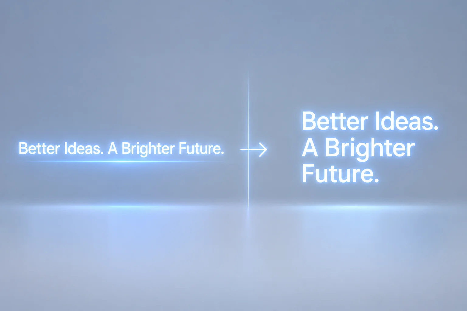
Techniques for inserting manual line breaks that support the natural reading rhythm.
Explore detailed walkthroughs covering typography hierarchy, viewing distance reviews, and consistent theme tokens.
Reviewing how three visual treatments of a dense 92-word announcement alter audience comprehension speed and distant legibility under live projection.
Uniform line lengths and zero vertical hierarchy force the viewer to read sentence by sentence instead of spotting key times.
Narrow line lengths prevent horizontal drift, but simultaneous two-card layouts divide viewer focus if no primary lead is set.
By isolating title, core logistics, and secondary metadata into distinct optical planes, viewers memorize date and venue instantly.
Compare all 6 evaluation parameters inside our full laboratory critique, including automated text fitting limits and multi-screen visibility tests.
Systematic research, reproducible heuristics, and production-tested layout principles designed to make presentation content instantly legible across every viewing context.
Real-world case evaluations dissecting overcrowded announcements, density limits, and verified layout breakdowns.
Explore CategoryTechniques for establishing primary, secondary, and tertiary reading paths without relying on oversized type.
Explore CategoryEvaluating measure, auto-scaling constraints, and intentional semantic breaks for projected widescreen displays.
Explore CategoryAnalysis of ambient lighting wash, photographic backdrops, and practical legibility ratios under real venue projection.
Explore CategoryStandardizing margins, typography tokens, and template rules across recurring presentation modules.
Explore CategoryAuditing protocols, viewing distance formulas, and final rehearsal run-throughs to ensure flawless delivery.
Explore Category