One Theme Across Three Announcements
2026-09-15 • By Marcus Thorne
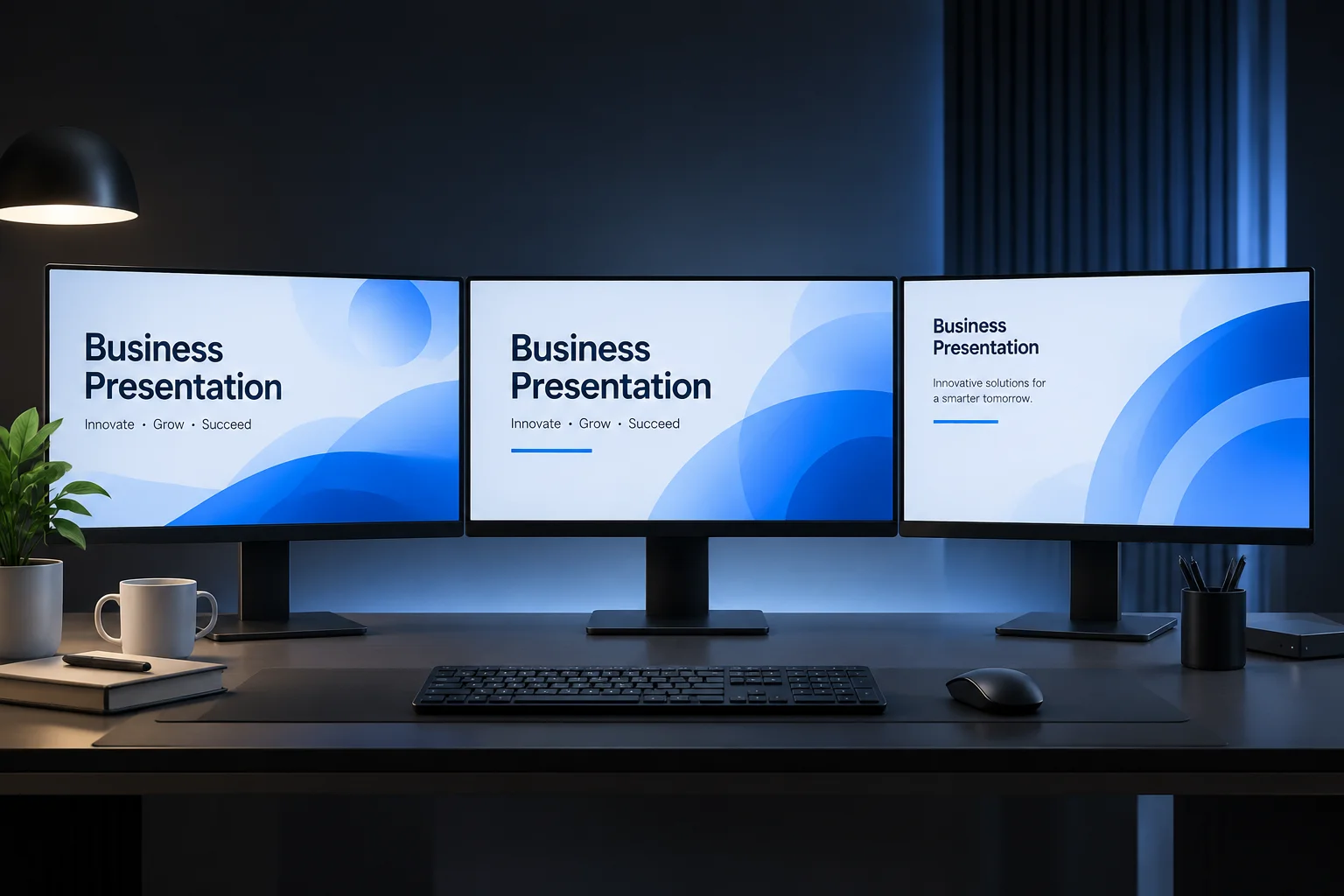
A consistent visual theme is the foundation of a professional presentation, but applying it to content with vastly different lengths presents unique challenges. In this case study, we examine how a single theme can be deployed across three distinct announcement types while maintaining readability and visual hierarchy.
The Anatomy of the Content
Our samples include a short single-line headline, a standard paragraph-length bulletin, and a dense, multi-point event notice. The challenge here is keeping the theme intact without defaulting to poor scaling or aggressive text compression.
Adapting to Variability
Design teams often rely on software to "autofit" text. While useful, it rarely produces the best results. By applying manual line breaks and adjusting text box margins before the automated scaling kicks in, we retain control over the rhythm of the text.
Consistency Through Constraints
Even with varied text volumes, the background shapes, icon placement, and typography size for titles remained locked. This creates an immediate cognitive connection for the viewer: no matter the content volume, the slide is instantly recognizable as part of the same series.
Summary of analysis
- Locked typography: Keep title sizes and styles static to preserve brand identity across varying slides.
- Manual line breaking: Never trust automated text fitting for complex announcements; break lines where they make sense linguistically.
- Margin management: Use consistent container paddings to ensure text blocks don’t feel cramped as the character count grows.
- Visual anchors: Maintain fixed placement for secondary elements (logos, decorative shapes) so the slide series feels cohesive in motion.
- Content density check: If the text requires significant shrinking, prioritize content reduction over font size manipulation.
Comments
James P.
Seeing the same theme applied to different lengths of text is incredibly useful.