 Oct 25, 2026
Reviewing Text Scaling Decisions
Why automatic text scaling can compromise readability and how to review line lengths manually for large venues.
Effective line breaking is an essential skill for managing complex content on projected screens, ensuring that text remains readable without losing its intended emphasis or meaning.
When managing slides, designers often face a dilemma: a single line of text might extend too far across a wide aspect screen, straining the reader’s eye. This horizontal strain frequently leads to skipping lines or losing focus entirely on the point being presented.
We advocate for controlled, manual line breaks that enforce a consistent visual rhythm. By treating a slide like a refined typographic layout rather than a simple text field, you ensure that every viewer captures the message effectively.
Instead of relying on automated wrapping which can cut words at random positions, manual intervention allows for logical breaks. This supports readability, as the reader naturally pauses where the content is structurally separated.
Integrating these breaks requires an understanding of how text density impacts perceived cognitive load. A block of text that looks dense requires more effort to decode, whereas a strategically broken layout invites closer engagement.
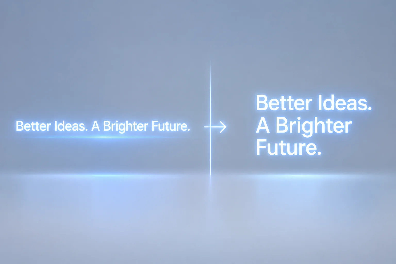
Figure 1. Operational visual breakdown of line lengths on large-scale projected displays.
"The difference between a cluttered slide and a clear message lies in how you command the viewer's eye through thoughtful line breaks."
Begin by identifying the natural phrases within your slide content. Breaking lines after a preposition or an article can often create a jarring reading experience, whereas breaking at a comma or a conjunction feels more natural.
Focus on consistency across your presentation deck. If one slide uses a specific line length, ensure subsequent slides maintain similar proportions so the audience isn't forced to recalibrate their scanning speed repeatedly.
Furthermore, consider the physical viewing distance. What looks like a short line on a laptop screen might appear significantly wider on a 20-foot projection screen. Always review your content from the perspective of the back row.
If you find that text remains too wide despite manual breaks, reduce the content volume or introduce secondary typography elements to create visual breathing space.

Marcus Thorne is a professional presentation designer and editor with over a decade of experience in optimizing visual communication for live event environments.
Download our diagnostic checklist to evaluate projected slide line lengths, paragraph scaling, and typography consistency before live execution.
Oct 25, 2026Why automatic text scaling can compromise readability and how to review line lengths manually for large venues.
 Sep 30, 2026
Techniques for inserting manual line breaks that support natural reading rhythm and maintain editorial clarity.
 Aug 18, 2026
Evaluating how font weight, background contrast, and character count interact on high-luminance LED walls.
Comments & Opinions
No comments yet. Be the first to leave a comment.
Leave a Comment
Share your thoughts or observations on presentation line length decisions.