 Nov 10, 2026
Line Length and Presentation Clarity
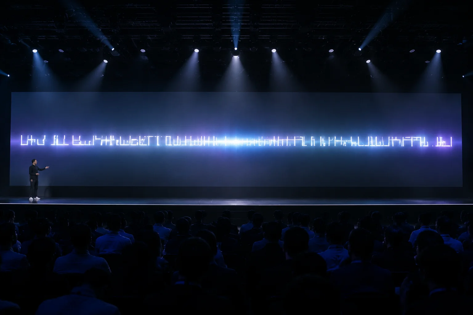
Examining the optimal character count per line for projected presentations to ensure maximum impact in the room.
Automatic text scaling is often a hidden culprit in layout failures. This guide helps you identify when your presentation software is over-optimizing for fit and how to force manual control to preserve readability.
When your software attempts to squeeze large amounts of text into a fixed container, the primary goal is often fitting content rather than preserving readability. This results in typography that shrinks or expands based on the current slide’s character count.
This dynamic adjustment ruins visual rhythm. When a viewer looks at a sequence of slides, their eye expects uniformity. Drastic size jumps between slides force an unnecessary cognitive burden on the audience.
Furthermore, software often miscalculates the relationship between letter spacing and line height at extreme sizes. Smaller, auto-shrunk text can lose its distinction and look crowded, while overly large text might break layout boundaries unexpectedly.
Manual review ensures that the scale remains grounded in established design tokens. By overriding these automated functions, you reclaim authority over the visual presentation.
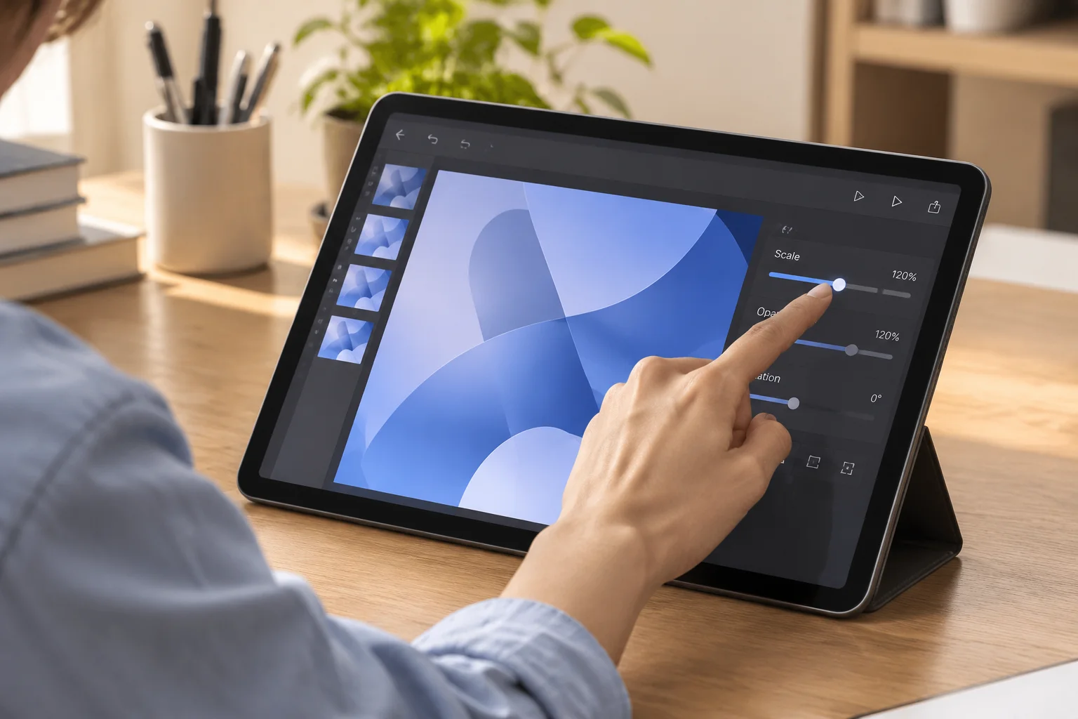
Figure 1. Precise manual control is the cornerstone of professional slide readability.
"If a slide forces software to automatically shrink text, the slide is already too dense. You should cut content, not size."
Begin by setting fixed text boxes. Disable all 'autosize' features within your theme editor. When you lock the font size to specific increments, you force your workflow to address excess content immediately.
If content doesn't fit, consider splitting it across two slides. This forces a focus on narrative pacing, allowing each point to land more effectively.
Another strategy is using manual line breaks to control line length specifically. By forcing content to wrap where you want it, you control the character-per-line (CPL) count directly, ensuring every line remains readable from the back of the room.
Review these choices in a live environment to confirm that they work as intended under projection conditions.

Presentation Engineer with over 10 years of experience in large-scale event media. Specializes in readability optimization for high-density conference environments.
Download our diagnostic checklist to evaluate projected slide line lengths, paragraph scaling, and typography consistency before live execution.
Nov 10, 2026
Examining the optimal character count per line for projected presentations to ensure maximum impact in the room.
 Sep 30, 2026
Techniques for inserting manual line breaks that support natural reading rhythm without disrupting the meaning.
Comments & Opinions
Rachel G.
Oct 24, 2026
Automatic scaling usually ruins my layouts. Good to know what to check manually.