 Oct 25, 2026
Reviewing Text Scaling Decisions
Why automatic text scaling can compromise readability and how to review line lengths manually for large venues.
Exploring the critical relationship between character count and legibility for large-scale event projections, where excessive line lengths often hinder comprehension.
In the context of large-scale presentation environments, readability isn't just about font size. It is deeply connected to how much text an audience must process in a single horizontal movement.
When lines of text are too long, the eye struggles to find the start of the next line, often leading to skipped words and loss of content flow.
ProPresenter designers often neglect this by letting text boxes stretch edge-to-edge. This mistake causes characters to spread out far beyond the comfort zone of a human reader.
By defining clear boundaries, you keep the focus center-mass, where projection quality and contrast are usually most uniform.
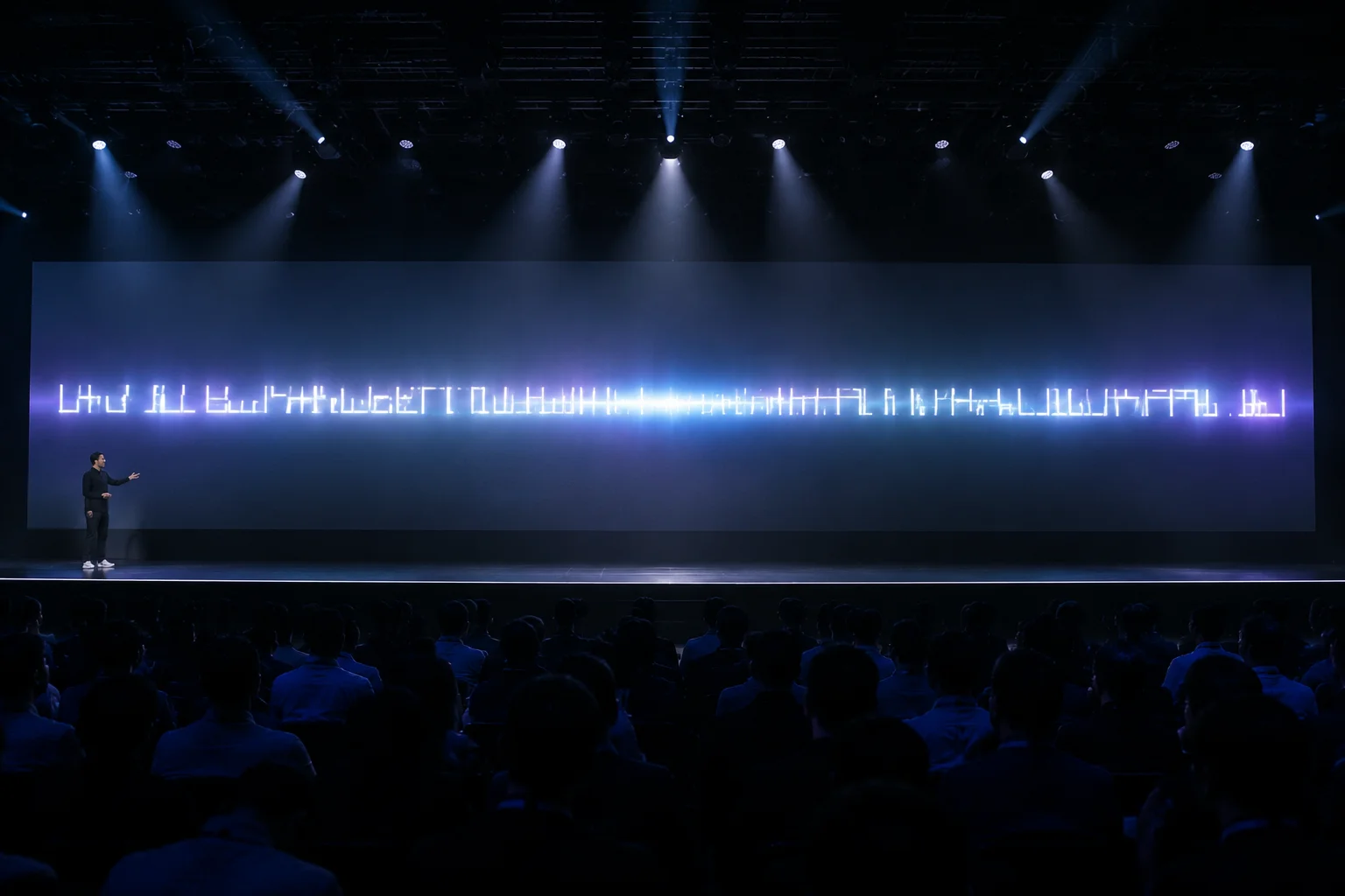
Figure 1. Operational visual breakdown of line lengths on large-scale projected displays.
"The difference between a readable slide and a confusing one is often just a few inches of horizontal margin."
Implementing fixed width containers is the easiest first step. You can constrain your primary text boxes to roughly two-thirds of the total slide width.
This approach forces the line length to remain within the optimal 45-75 character range, regardless of the screen size or aspect ratio.
Additionally, consider using manual line breaks during the rehearsal phase. This provides you full control over phrasing and rhythmic reading pauses.
Over-relying on automatic text scaling is a common trap; always manual check your layouts after changing font sizes.

Chloe Bennett is an expert in visual communication design, focusing on large-scale environments and audience accessibility.
Download our diagnostic checklist to evaluate projected slide line lengths, paragraph scaling, and typography consistency before live execution.
Oct 25, 2026Why automatic text scaling can compromise readability and how to review line lengths manually for large venues.
 Sep 30, 2026
Techniques for inserting manual line breaks that support natural reading rhythm and maintain editorial clarity.
 Aug 18, 2026
Evaluating how font weight, background contrast, and character count interact on high-luminance LED walls.
No comments yet. Be the first to leave a comment.
Leave a Comment
Share your thoughts or observations on presentation line length decisions.